Visuals
Wild mix ahead
I escalate quite often in terms of creativity, in digital shape as well as analogue shape 🙈 Usually, I don't really share much of what I do, and I still have way more than the examples shown below, like watercolor and oil paintings, wax crayon stuff and what not.
Vector graphics
I use Inkscape for creating my SVG-vector stuff. I prefer the flat look, so not really working a lot with, for example, gradient fills.
Well, working in the IT for quite some time, I some day felt the desire for some some emblem, and, due to some reason, the clown skull with red nose over crossed clown horns just seemed to fits best.
There's no "too early" in case your curiosity and intrinsic motivation make you absorb topics like technology, music, visuals and mathematics, don't you agree?
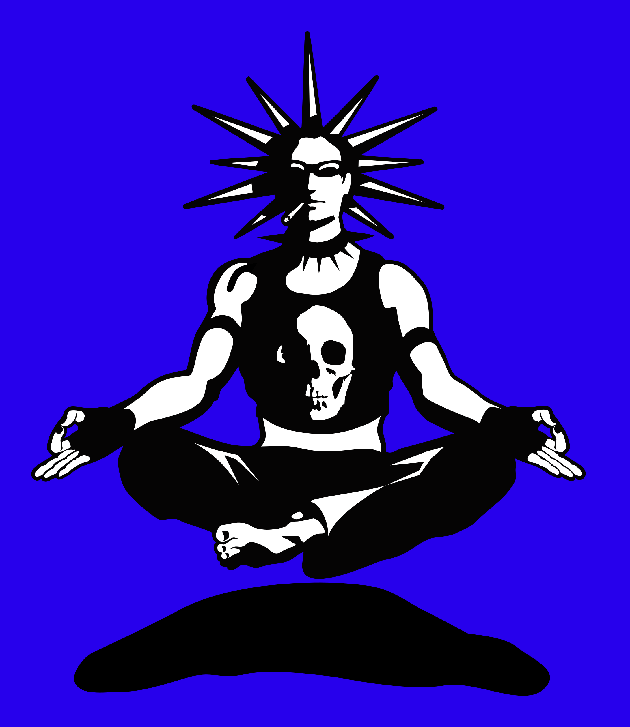
Because hey, being a chilled, levitating and meditating punk looked like some nice motive idea.
A key visual I made for a record company that no longer exists.
Well, I was a skater back then, and am still skating every now an then, even though I never made grabs and handstand-tricks, but rather just did some street style stuff...
Newer digital drawings
These were basically made with tools like Adobe Photoshop ® and Krita, and most of them are five plus years old, because I nowadays prefer to do vector graphics or something I call pixelated interpretations.
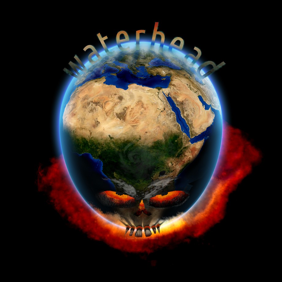
Done out of boredom - just wanted to create some literal interpretation of the term 'waterhead'. I used this as a landing page visual on my previous web page.
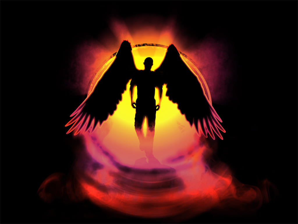
I really liked the idea of doing some heroic motive, like some dude with wings, and wanted to do some foggy effect in some backlight-scenario.
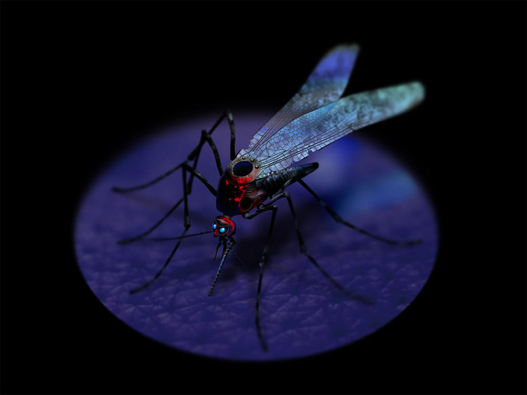
Even this might look rendered, it's actually not, but instead, it's realized as a (too-) many-layered photoshop graphic, mainly brushed and smeared, but also used some masked textures here and there. Some depth-related blur makes the general appearance way more plausible.
Analogue brush and smear (pencil drawings)
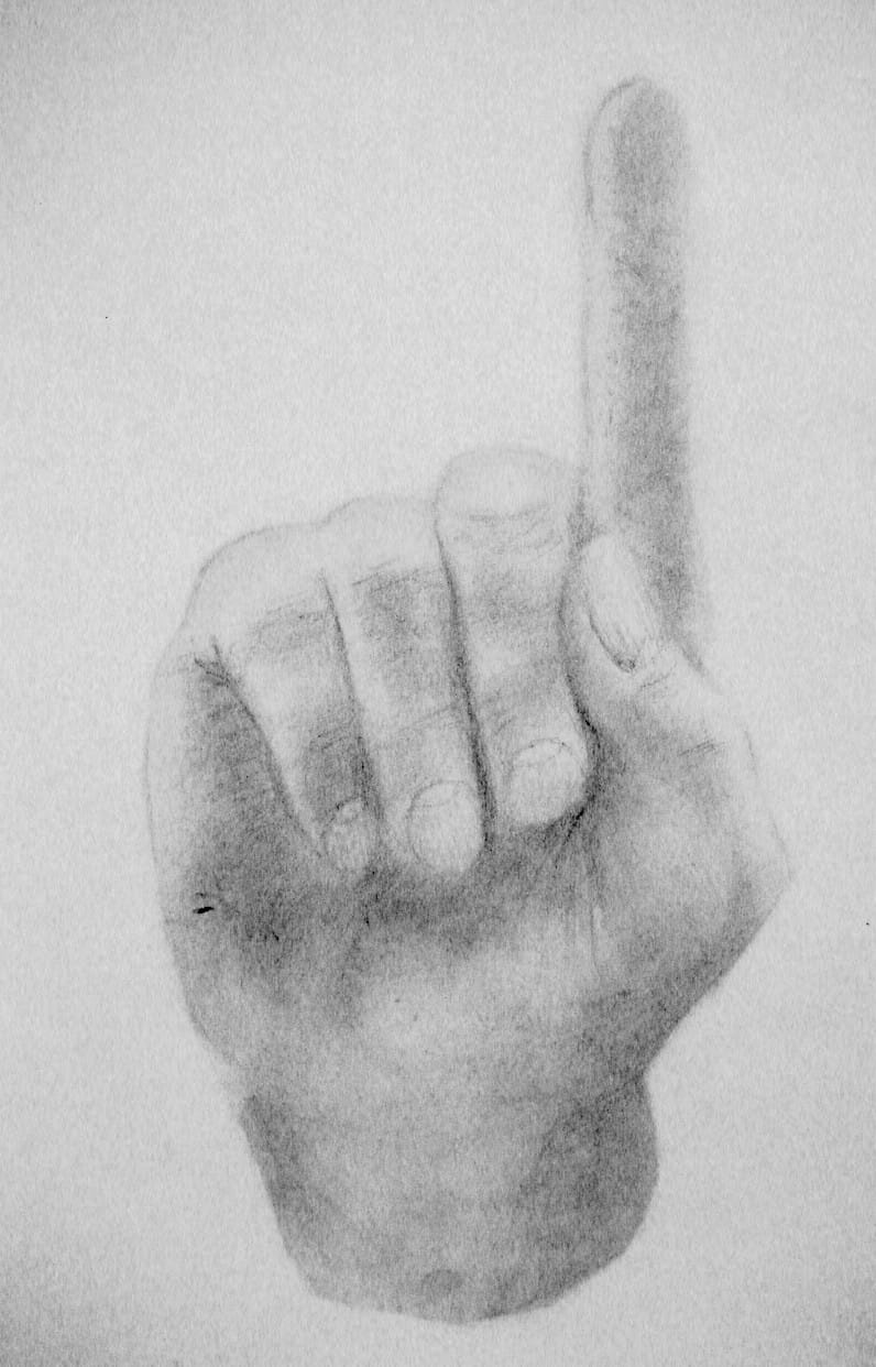
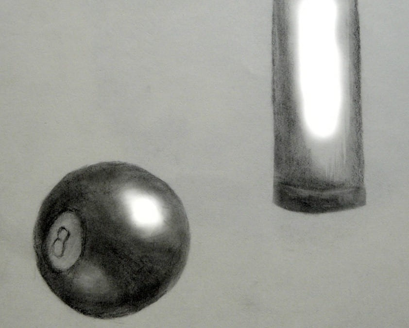
Yeah, some analogue 'pencil and paper'-stuff.
Just some sketch of my own hand.
I played a lot of billiards in the past - no more, but in the past...
Digital brush and smear
This is pretty old stuff, too... back then, when I got my fingers on that functionality in Adobe Photoshop (v3, if I remember correctly), I started producing graphics by mainly using the brush and smear tools. Was quite fun.
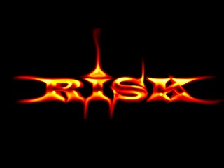
Fire-like effects were pretty easy to achieve. Very old logo, around 2000, I guess, because the dimension of 320 x 200 pixels imply some Atari-related use was intended.
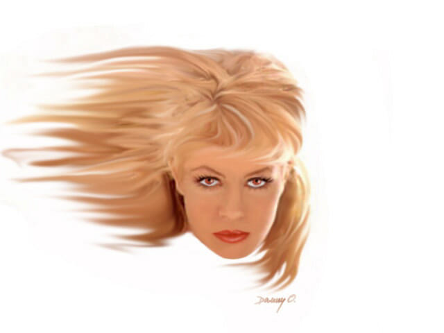
This is from 1997, if I remember correctly, and pity, I only have this bad quality JPG of it, because I lost the original file in one of the several hard disc head crashes of my life. 😅
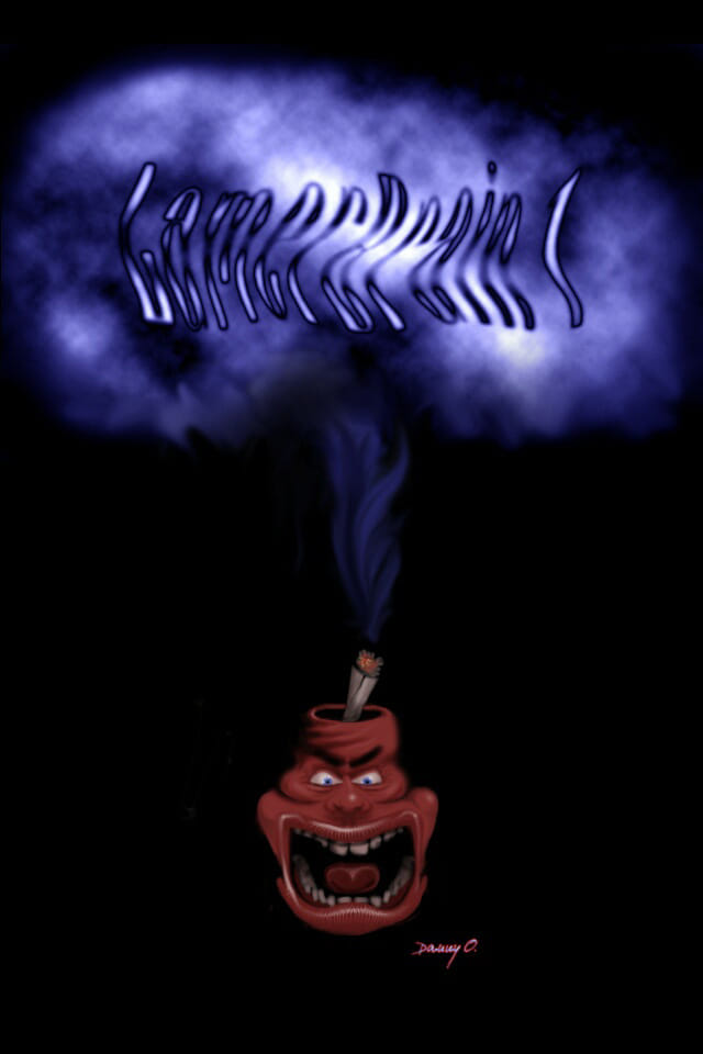
Made in 2001, was meant to be the title screen of some demo I worked on, which, as many other things, was never finished, but instead died some data loss.
Pixel interpretations
These graphics aren't created 'the old demo scene way', in which we used to start pixel graphics from scratch, with copying motive-proportions as solid-filled polygons and lines, sketching lighted and shadowed areas, and then worked on each surface pixel-for-pixel until we finished the pixel graphics.
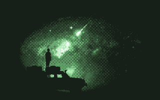
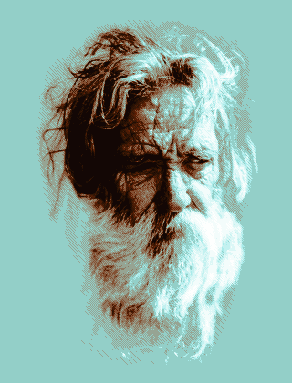
Instead, the graphics below are based on existing motives, like photographs, and were quantized down some limited number of colors, like 8 colors or 16 colors, so they end up as, well, a pretty ugly, but nevertheless, base for then start fiddling with abstractions and dithering-tricks.
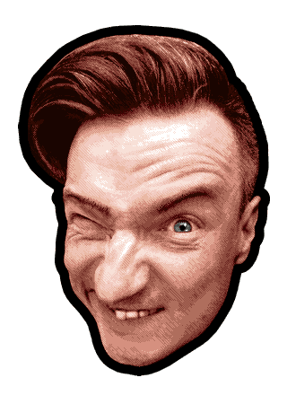
2022, 16 colors, based on a selfie I took, so this is literally me.
Pixel graphics
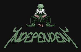
But these following graphics were made the 'old demo scene way', which we created by literally arranging pixels from scratch, nothing quantized as a starting point - used in demos back on our Ataris and Commodores, which was fun as hell.
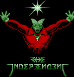
1993, 16-color, some logo of 'The Independent', a demo group collaboration our 'Risk' demo group was a member of, used in the
Lamerbrain Disk 2 mega demo.
A simple, 16-color palettized level-information for a game that basically never came to life.
1993, 16-color, some other logo of 'The Independent'
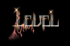
1995 (probably? not sure when I did this), 8-color palettized logo for some production I basically never finished. Was stored as JPG in between, which unfortunately killed a lot of the gradients and dithering.
